Showing posts with label Anatomy of a Cover. Show all posts

Saturday

Anatomy of a Cover: Jeremiah Goldson on Rogue Agent Zed


Jeremiah Goldson and I have been working on Rogue Agent Zed for the last five years.  That's a lot time, dedication, and commitment.  As we head down the home stretch, let's take a look as we put the proverbial icing on the cake.  This is one of the finishing touches to the project -- and maybe one of the most important ones -- the cover.

Jeremiah starts out with the light pencil sketch, beginning the inking process on the primary focus of the piece, Rogue Agent Zed standing in the foreground:


The process continues as the two lead characters get inked and the piece starts to come together.


Having finished up the special ops agents, the background starts getting Jeremiah's trademark level of detail.


And here's the piece with the pencils and inks done.  We're talking about one seriously awesome illustration!


My first choice of colorists, Paul Little, mentioned he had a small window on his schedule to work on some new pieces.  I immediately jumped at the opportunity to secure his talents.


I asked for some minor adjustments (lighten up the levels, change the hair color, mute the intensity on a couple of the costume elements) and we slapped some text and logos on.  Voila!


I have to say, watching this cover come together was a real thrill.  I love the finished product, and I think that it's a fitting cover for a project that's been five years in the making.  Looking at this, I can't help but think: it's been worth the wait!

Anatomy of a Cover: Marco D. Carrillo on Astro Crusader #1


Let's take a quick look at process of coming up with a cover for Astro Crusader #1.

First, original artist Fabio Nahon sketched out his idea.  I loved the linework, but worried that our hero looked a little too thick and blocky around the midsection.  I wanted him to be more sleek, and less muscular.


Then Marco D. Carrillo stepped up and came up with a cool composition.  I thought it was very dynamic, but I decided it might be better to show a little more of the character's costume.


This was the basic composition Marco and I finally agreed on.


Here are the finished pencils and inks:


Marco takes a first pass on the colors.  I thought the cloud effects were a little distracting, and I asked him to turn down the intensity on both the power beams and the reflected light on Astro Crusader's costume.


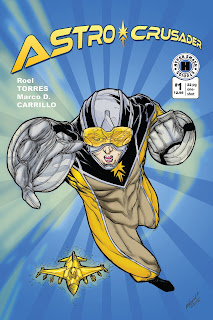
And here's the finished product:


Bright, clean, and pop-infused!  Nice work, Marco!  I love it!

Anatomy of a Cover: Jeremiah Goldson on Monica Furious: SuperDestroyer #1


Let's take a quick look at Jeremiah putting together the cover for his creation,  Monica Furious: SuperDestroyer #1.

Here's the pencil rough (with a couple of interior sequentials peeking over the side.)  The basic idea is already there, and now Jeremiah just needs to follow through and execute.


After a couple of minor revisions and improvements, here are the final pencils and inks.


And then we bring our secret weapon on board -- Colorist Extraordinaire, Paul Little!  Paul works his magic and here are the gorgeous results:


Wow wow wow.  That's a seriously dangerous cover!  Unbelievable!

Anatomy of a Cover: Marco D. Carrillo on Battle Team Omega #1


Let's take a look at how Marco puts a cover together. First, we get the loose sketch:


Then he does a more detailed rendering and inks it:

And here's the final product with colors and logos:


Looks great!  Thanks for the awesome cover, Marco!