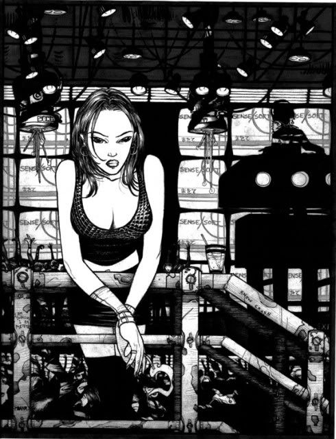
 This is an excellent signature piece, and features many of the cyberpunk elements characteristic of Jeremiah's work -- dark, moody, with the sinister atmosphere of technology gone unchecked. (Make sure the contrast on your monitor is fine enough so that you can appreciate the level of detail at the top of this illustration!)
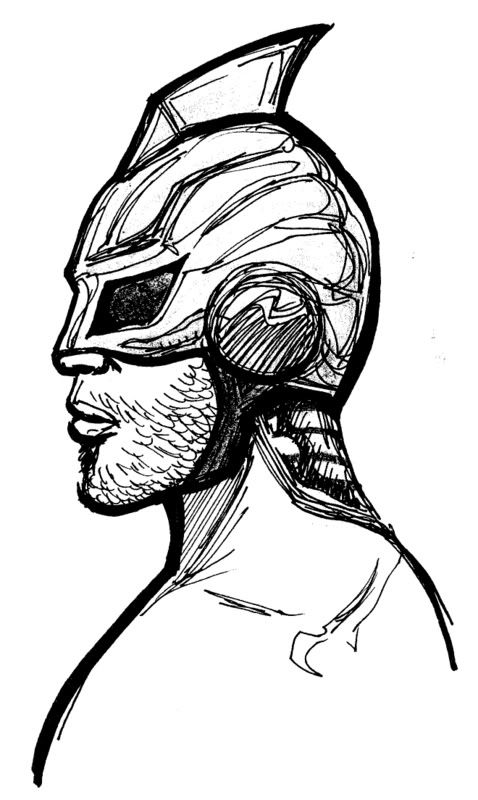
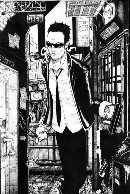 One thing that separates Jeremiah from his peers is his use of the backgrounds and surroundings to really enhance the mood of his art. In his work, the environment takes on a life of its own, and the scenery is almost as noteworthy as the human subjects he's drawing.
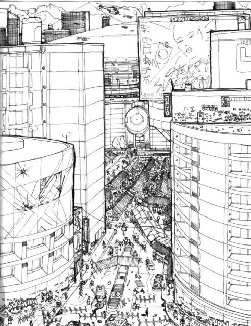 When you look at this sketch, it’s obvious that Jeremiah’s not looking to take any shortcuts. When he draws a city, he wants to tackle the challenge of making it feel busy, dense, and disorganized. It's a true testament to his dedication to craftsmanship.
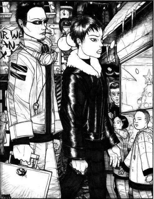
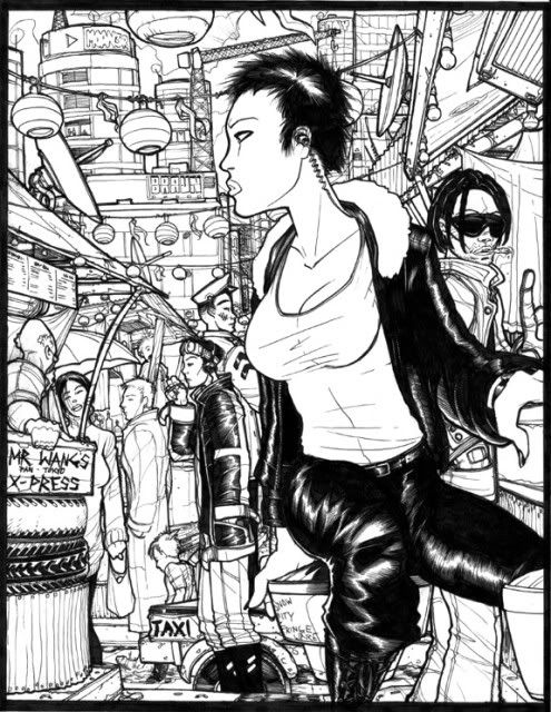
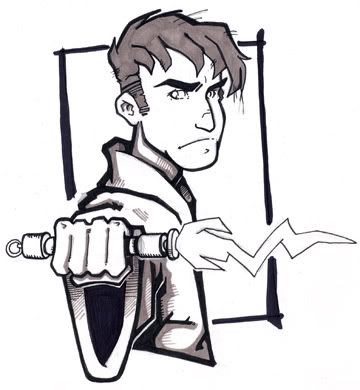
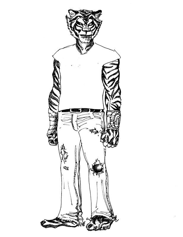
 Even without any words or narrative, Jeremiah is able to tell a story and give you a sense of character through the stylistic choices he makes. By examining this man in his surroundings, looking at his posture, and noting the indication of his vices, we immediately develop a distinct sense of his personality. (Note: Jeremiah's character looks like he would get along just fine with the protagonist in our collaboration, Rogue Agent Zed.)
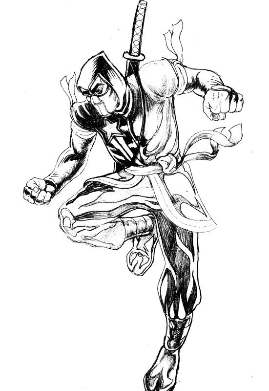
 Jeremiah's manga roots are on fine display in this piece, which leaves a lot of open space that would be very nicely complemented by the work of a good colorist.
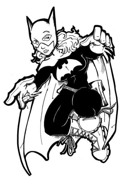
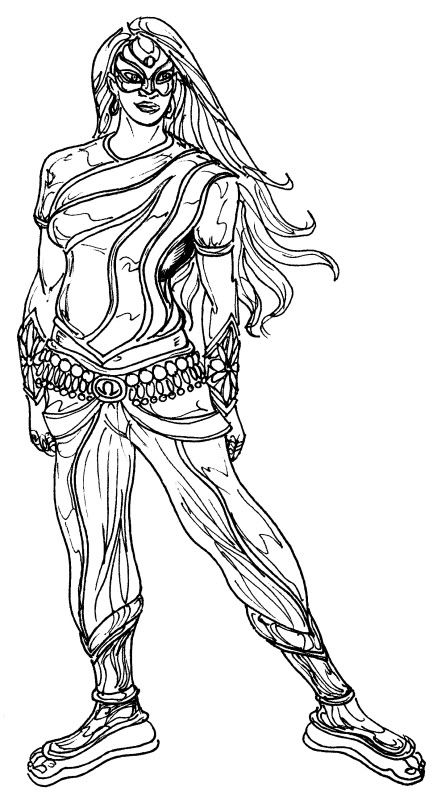
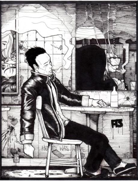
The thing I love about this drawing is that it clearly demonstrates that he's not a one-trick pony. Stripped of his characteristic style choices, he still manages to create a wonderful image that’s cute, sweet, and memorable. This is an artist with a full arsenal of skills in his toolbox, and I’m excited to see the work he will produce on Rogue Agent Zed. Aren’t you?
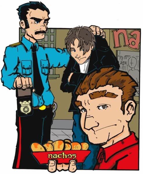
Looking at this incredible work, it would be perfectly natural if some of you were suspicious that Jeremiah was one of those artists who only specialized in pin-ups and splash pages (and we all know a couple of artists who fit that description.) But I'm happy to report that his talents extend into the realm of sequentials and panel-to-panel continuity. A couple of posts from now, we'll feature Jeremiah's work again, highlighting his ability to tell a story and lay out a page. It's exciting stuff, I promise. See you then.
To see much more of Jeremiah Goldson's stunning artwork, please visit his site. You won't regret it. Tell him I sent ya!